Tuesday, March 30, 2010

Kubuntu's New Logo

Kubuntu logo
The old Kubuntu logo
Image via Wikipedia

Remember when I said that the new Xubuntu logo was a great model and that other projects like Kubuntu should follow in its footsteps? No? Well, I did. Here's my "I told you so" dance. First mine.

Now let's see what they really did.

Yeah, I got the "k" wrong, but in my defense, the font isn't finished or published. Oh, and theirs looks better. And the emblem is better and more inspired. And ... just about everything is better about theirs.

I suck as an artist. I suck at music, too. ;)

Look at the new boot screen.

Uh oh, old logo alert!. They definitely should have used the same arrangement in both pieces. Thanks Linuxers!

Monday, March 29, 2010

Moovida 2.0 to Get Rewrite, Going Non-Free

FluendoImage via Wikipedia
The Moovida developers (Fluendo) have explained the slowdown in development of the current 1.0 version: it's being rewritten in a different language and with a different architecture, and there's little time to work on 1.0. The new project will be "open, but not to the same extent that 1.0." It will also offer premium content.

Not good news for the little media center that could. It seems time for a fork of the last Free version.

Wednesday, March 24, 2010

New in the Mint 9 Menu


Linux Mint 9 has some cool new features for the menu

  • You can now edit items directly from the menu. If you want to change the name, the icon, the description or even the command for a particular application, just right-click on it and select “Edit Properties”.
  • If your graphics card allows it (you need compositing for this to work), you can change the transparency of the menu. Go in the preferences, select the “Options” tab and change the percentage of opacity.
  • There are two new context menu item to let you easily add shortcuts to the panel or the desktop.
  • An option which you can enabled to “always start with the favourites”.

Ubuntu User Survey

Yet Again -- I Feel So Alone

Yet another post on Canonical Voices about a new Mac. Hasn't anyone ever heard of dogfooding?

Friday, March 19, 2010

Is the Scrollbar Going Away?

Shuttleworth in the International Space StationImage via Wikipedia
Mark Shuttleworth recently posted:
Our design roadmap calls for us to reduce the visibility of scrollbars,
and emphasise:

 - touch scrolling
 - scrollwheels

Most people don't scroll with the scrollbar any more. The use the
scrollbar to gauge "how much fo the document am I seeing".
Interesting view on the direction of Ubuntu.

Democratic, Meritocratic, or Dictatorship?

Photograph of Mark Shuttleworth by Martin Schm...Image via Wikipedia
Webupd8 has an article about Mark Shuttleworth's comment on the left-side button decision which quotes from the bug report:
This is a difference between Ubuntu and several other community distributions. It may feel less democratic, but it's more meritocratic, and most importantly it means (a) we should have the best people making any given decision, and (b) it's worth investing your time to become the best person to make certain decisions, because you should have that competence recognised and rewarded with the freedom to make hard decisions and not get second-guessed all the time. 
It's fair comment that this was a big change, and landed without warning. There aren't any good reasons for that, but it's also true that no amount of warning would produce consensus about a decision like this.

> If you want to tell us
> that we are all part of it, we want information, and we want our opinion
> to be decisive.
>

No. This is not a democracy. Good feedback, good data, are welcome. But we are not voting on design decisions.

Mark
 Martin Owens makes a comment that Ubuntu is not really a meritocracy. Is that true? Is Ubuntu really democratic? Really meritocratic? Actually a dictatorship (as Mark Shuttleworth's "SABDFL" title implies)? Does it matter? Which is better for Ubuntu in the long run.

I don't think that there's anything wrong with being a dictatorship, as long as the leader is good. The Linux kernel is a reasonable example. OS X might be, too, depending on your stance on Free Software.

Shortly after it was introduced, Ubuntu leapt past other, more entrenched distros primarily because of its ability to build a large, active community. The Ubuntu Forums were almost immediately filled with people giving their time to help. Ubuntu Brainstorm came about to help identify problem areas in the distro. Ubuntu's active community is almost certainly the largest of any distro.

The activity of the community leads to the impression that Ubuntu is a community-driven project. It's not, really. Mark seems to imply in his comment that the best and brightest who further go on to prove themselves are given a kind of voting privilege or influence on the decision to be made.

From the outside, it appears to be more of a dictatorship, with advisors being appointed by merit. I'm okay with that, actually. In fact, I think more direction would be good for the project. This is FLOSS: people who don't like that model (or the direction) can change projects or fork. (I'm serious, not trolling.)

Wednesday, March 17, 2010

How I Know That Google is not Truly Evil Yet

I received an e-mail about Adsense today:

We have launched a new capability in AdSense allowing Google-certified ad networks compete directly within AdSense, which means that advertisers from these third-party networks will be able to compete with AdWords advertisers to show on the Google Content Network.
These new capabilities will automatically be enabled for your account, and you'll see a new section in your Ad Review Center where you can allow or block specific ad networks or all networks except AdWords. Please note that we'll gradually be adding new ad networks to AdSense accounts over the next few months, so you won't see any immediate impact on your ads or your earnings.

To ensure the quality of the ads that appear on AdSense publisher websites, Google will certify all participating ad networks for adherence to our standards for user privacy, ad quality, and speed. Some participating ad networks use targeting methods similar to Google's interest-based advertising to show more relevant ads to users on the sites they visit. These ad networks won't be permitted to collect data from your site for the purpose of subsequent interest-based advertising, but we'll allow networks that comply with user privacy guidelines to show ads using these tools. Publishers can opt out of user interest targeting from these ad networks, and Google has changed our requirements for third-party ad serving to reflect this.
We are currently only accepting ads from Google-certified ad networks in North America and Europe, but we will make this feature available to ad networks in additional parts of the world in the future.
In my opinion, Google doesn't have a monopoly on search. Sure, it has an enormous market share, which is growing, but there are other major players, and there's no lock-in for search. On the other hand, Google may very well have a monopoly on advertising in Adwords, and advertisers regularly claim that prices for keywords are much more expensive on Adwords than on other networks owing to the auction process.

Yet, despite making virtually all of its money off of this product, Google plans to open it up to competition. As far as I know, no government forced GOOG's hand. There was no mandate from the EU.

Google's leaders say that they believe the company can out-compete others in the industry, and their actions follow these statements. I believe that Google may actually believe them.

They're not evil (yet). Here's the Google blog.


Fluendo Media Center Incorporates Moovida and Other Fluendo Products

I've blogged a few times about Elisa cum Moovida, Fluendo's ten-foot interface for a media center. Moovida has been available in the Karmic repositories and in a PPA for folks who want to stay current. I have found it to be an excellent replacement for XBMC, Boxee and MythTV if you don't have a TV tuner. Here's a montage and a video of it in action.


>

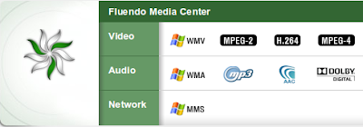
Until now, though, you've had to set everything up yourself. Admittedly, this isn't too difficult, but Fluendo has released a full media center version of Moovida which includes Fluendo's DVD player and full codec pack, meaning that you don't need to be concerned about the legality of installing DeCSS or restricted and Medibuntu codecs. It plays just about everything, as you can see below.


Fluendo describes the features:


  1. Photos:
    1. Slideshows
    2. Previews
    3. Album handling
  2. Video:
    1. Support for all major video formats
    2. Fluendo DVD Player integrated with all capabilities.
  3. Audio:
    1. Support for all major audio formats
    2. Organize music in playlists
    3. Dolby Digital 5.1 Sound System
  4. Others:
    1. Remote control support
    2. Automatic Media Detection using GStreamer
    3. Autodetection of media on your network
    4. Play Media over Samba & UPnP and DAAP shares
    5. Touch Screen support
    6. Search
Packages are available for all major Linux systems: DEB, RPM, and generic tarball. Because the product includes license DVD playback and codecs, it isn't free -- it's 40 Euros -- but the price includes a year of support, and longer support contracts are available for relatively little money.

Visit the Fluendo Media Center page to find out more and test drive the interface.


Monday, March 15, 2010

New Theme

Got a new theme. Does it work for you? Ten minutes' work won't get you much. Keep that in mind.

Tuesday, March 9, 2010

Wyse Technology Prepares Ubuntu Linux Thin Clients -- The VAR Guy

Canonical Ltd.Image via Wikipedia
Wyse Technology, the prominent thin client company, is preparing a “completely new product in the consumer and enterprise space” that leverages Ubuntu Linux, The VAR Guy has learned. Our resident blogger is nearly sworn to secrecy… Still, here are some preliminary details about the emerging Wyse-Ubuntu effort. Plus, the implications for Canonical (Ubuntu’s chief promoter) and channel partners that focus on thin clients.
See the full article. Really exciting stuff. I love thin clients as a solution and have used them in several businesses and educational settings. While they aren't a solution to every problem, there are many situations where using thin clients will save money on hardware and reduce admin time.

Oh, and I'm going to be in Austin in time for the Texas Linux Fest, but it is scheduled at the same time as my other interviews. I'm going to miss both that and the Thai DebCamp going on in Khonkaen next week. Meh!

Thursday, March 4, 2010

The Ubuntu One Music Store is Over-Engineered and Will Fail

The Ubuntu One Music Store is probably one of the most awaited new features of Ubuntu 10.04 Lucid. An integrated music store is something that many people have been waiting for for years. As the details come out, though, it's obvious that the store isn't going to work out as implemented. I'll cover the main points, but if you want the fine details, you'll need to read Getting Ready for Ubuntu One Music Store Beta.

Let's look at the process you need to follow to buy music, shall we?

  1. Register for an Ubuntu One account if you don't already have one.
  2. Confirm your e-mail address.
  3. Enable file-sync in Ubuntu One.
  4. Set up access to your computer for Ubuntu One.
  5. Open Rhythmbox.
  6. Go to the store and buy music.
  7. The music is sent directly to the Canonical servers.
  8. Wait for your music to be sync'ed to the Ubuntu One folder.
  9. It's been reported that Rhythmbox will automatically pick up the music from the Ubuntu One folder.
That process in itself is so long that few casual users will go through it. Think, though -- We still haven't touched on the problems with Ubuntu One storage capacity. Your music is sent to Canonical and is automatically sync'ed to all your computers, which is great, yes? Well, that's only great if my Ubuntu One account has room for the new music. What happens if it's full? Do I get an e-mail notification? Do I have to "clean out" my Ubuntu One account? It appears so, if you read the comments on the above linked article.

More importantly, I can't buy more than 2GB of music at a single time, less if my account already has files backed up.  Worse, the 7Digital site doesn't tell me the size of the download, so I can't be sure whether I have space in my account or not. Sure, I can guess that the 320kbps MP3s come out to a little over 200MB, but that means I've got room for nine albums without paying Canonical $10 per month for more storage. What if I want to spend 160 pounds and buy the top twenty albums? I guess I'll be doing that in three shifts.

Canonical needs to change something. Maybe it shouldn't count Music Store purchases against your Ubuntu One total.

It all would have been easier if the "Ubuntu One Music Store" were just a link that opened the 7Digital (or Amazon) page with a referral link and customers downloaded what they wanted from there. Over-engineering at its finest.

Why the New Xubuntu Logo is So Good

Take a look at the new Ubuntu logo.
Now look at the new Xubuntu logo.

This is a nice little logo which is similar and different enough to be very interesting (though I think the circle XFCE logo should be the same size as the ubuntu one). Now imagine if the other projects followed suit (my very quick visualizations are not up for criticism since the font is still in development and not available now).

See? A nice, unified look. What do you think?

Ubuntu Gets a New Look: What a Mess

Ubuntu got a new look today, and it's been covered widely, so I suspect you've seen it. If you haven't, take a look at the Ubuntu Wiki Branding page.

I like the new desktop theme. I like the new logo. The branding, however, is a mess. Take a look at the pictures below and count:

  1. The number of different color schemes
  2. The mix of old logos and new
  3. The mix of the old Ubuntu font and the new one.


From a branding standpoint, it's a mess. I hope that this problem is solved before April.

On the other hand, I think that Xubuntu has done a great job in creating a logo that's similar enough to be recognized as part of the brand but unique enough to differentiate the project form its mother ship.

I hope that the other projects follow the same style in their logos.

The dark theme is better than the light one. I hope it's the default. The light theme is a little to Mac-alike for Ubuntu to go with. Speaking of Mac, nearly every review has panned the left-side widow controls. It's definitely different for the sake of difference.

Other I' Been to Ubuntu Stories

Related Posts with Thumbnails